food that takes flight
food that takes flight
Brand Identity | Print Collateral | Package Design
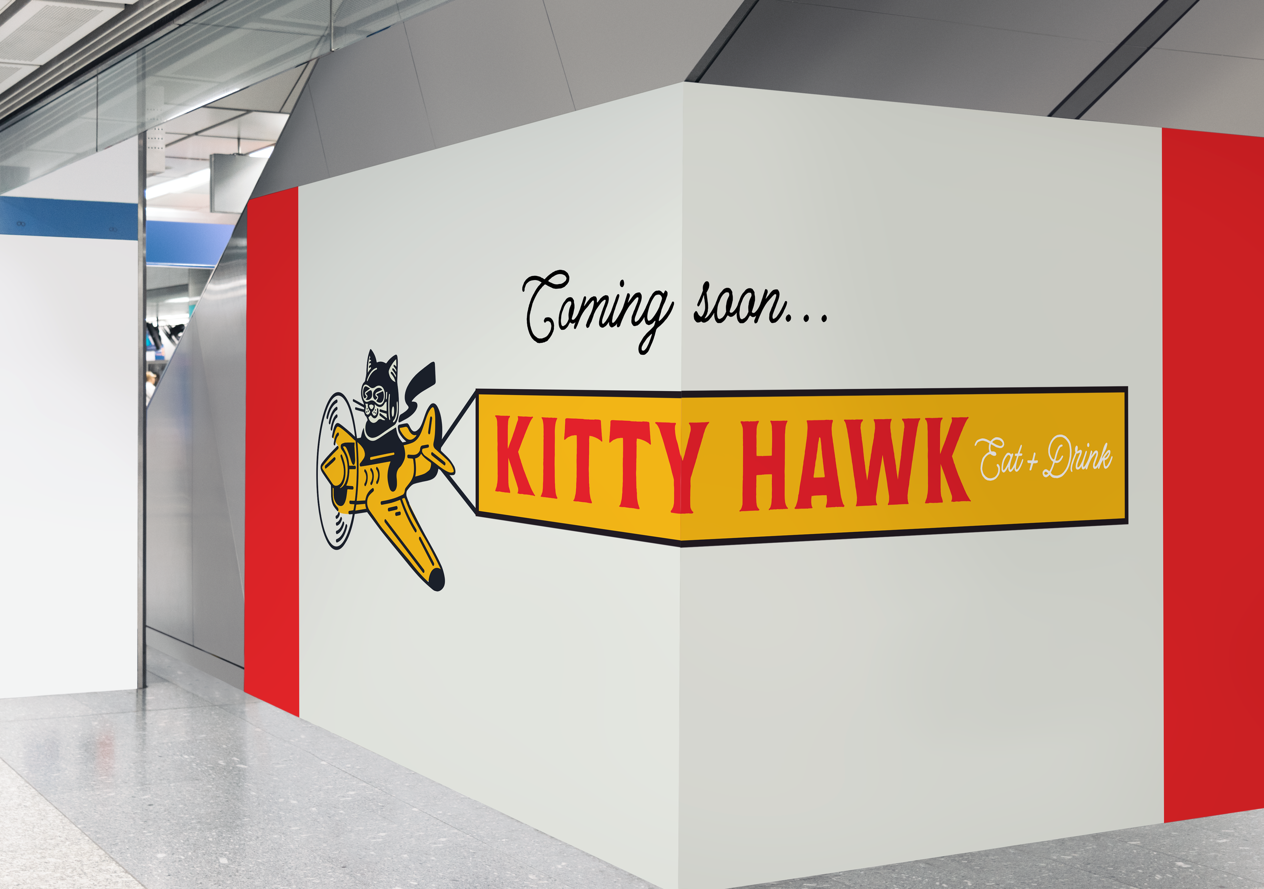
New brand creation for the Nashville Airport’s newest fast-casual eatery.
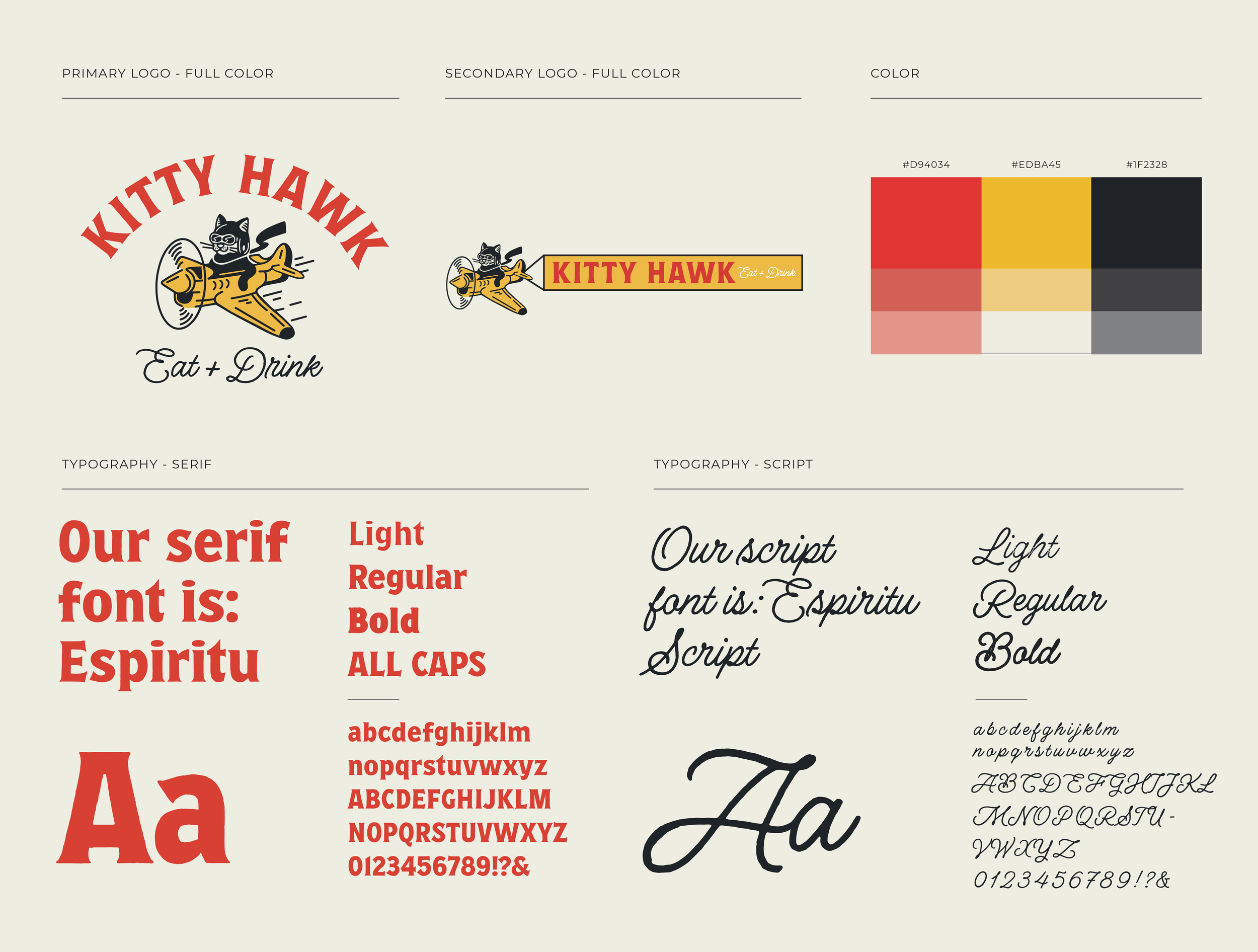
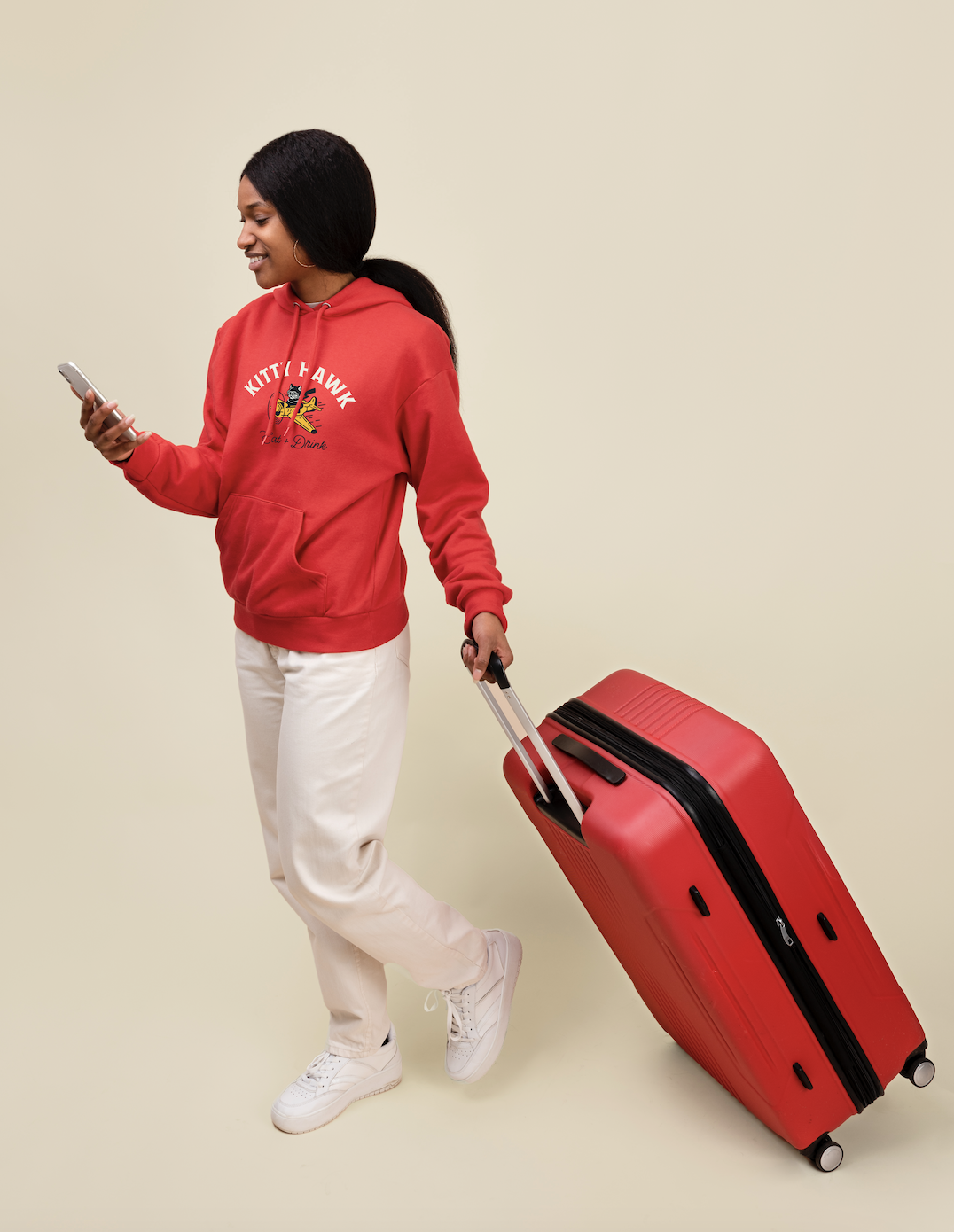
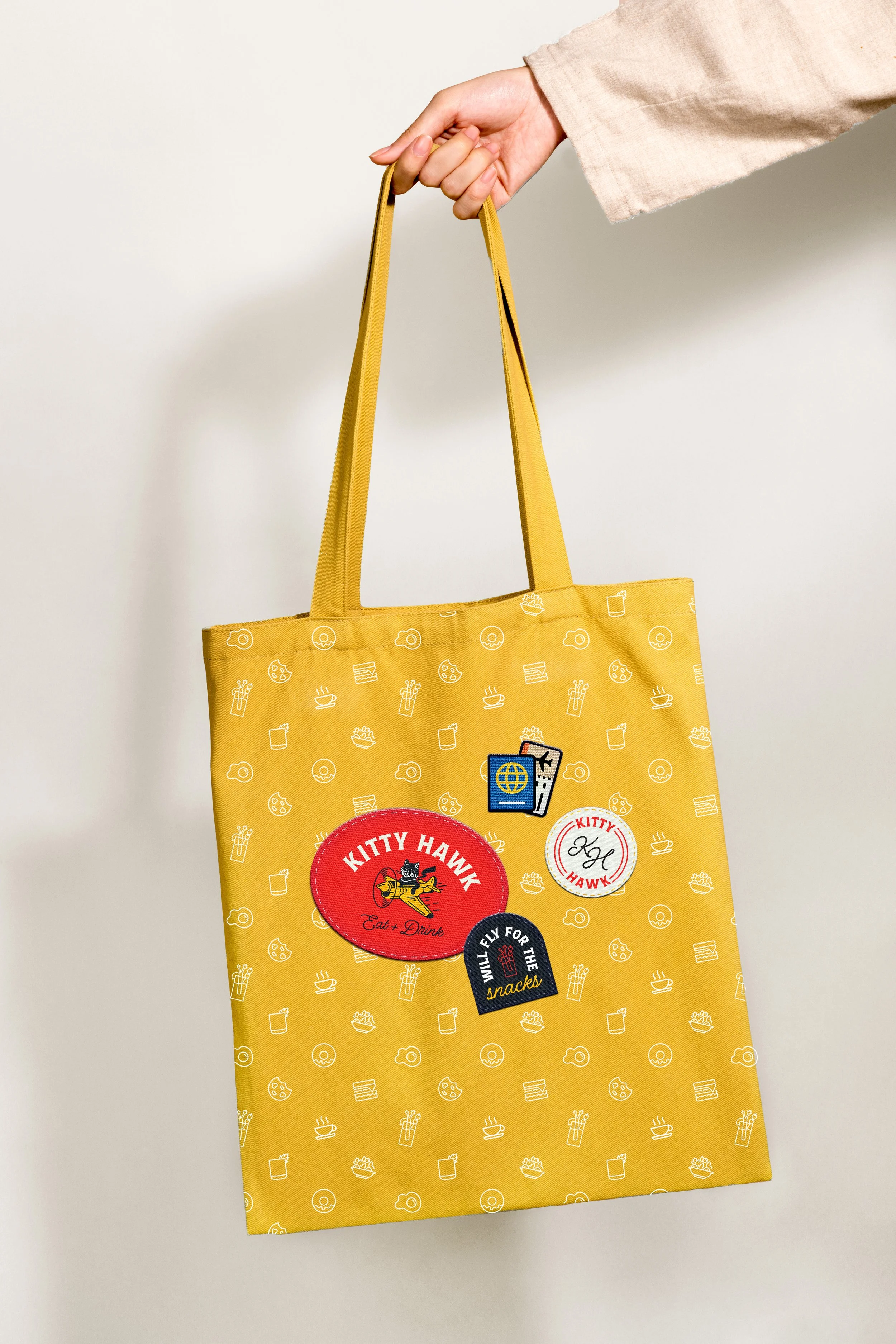
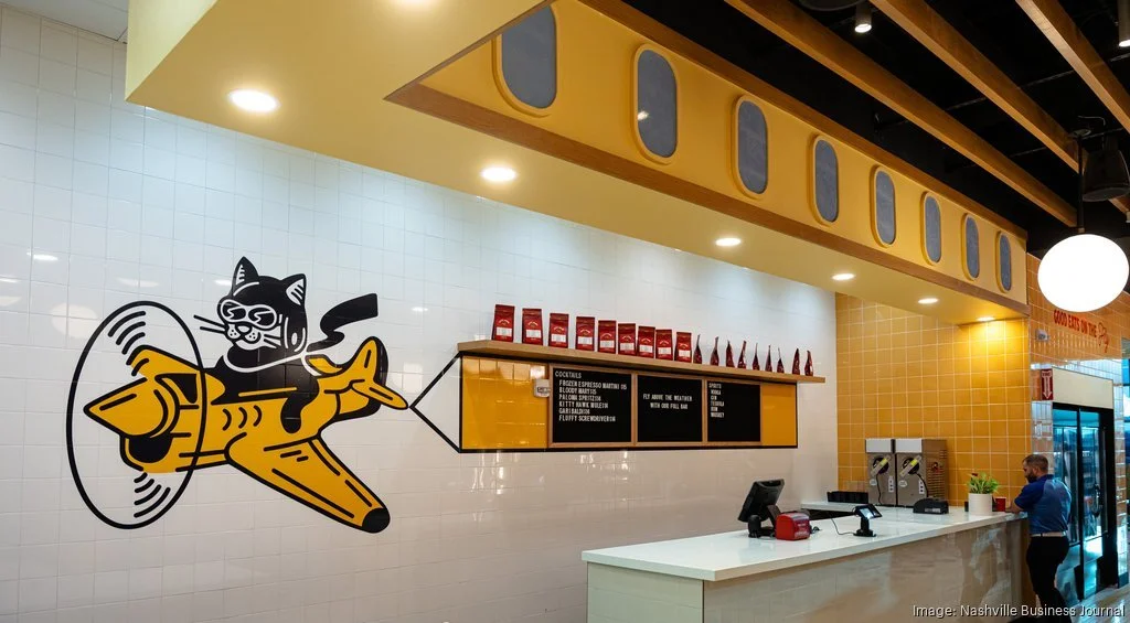
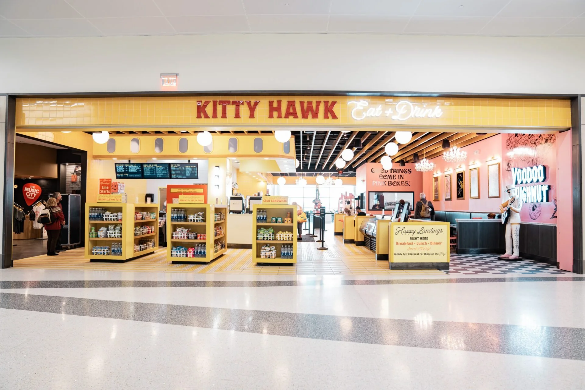
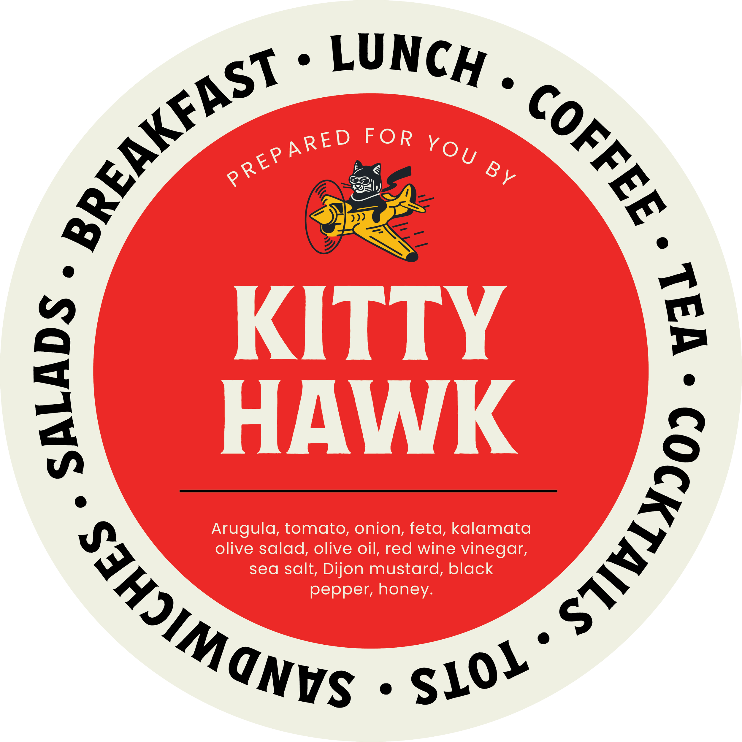
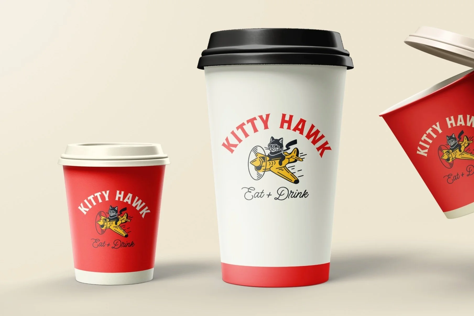
In partnership with Strategic Hospitality, I led the creation of Kitty Hawk from the ground up—crafting everything from the name and logo to menus, wallpapers, custom tile, and interior design assets. This fully realized brand brings a cohesive and immersive identity to their newest restaurant addition.
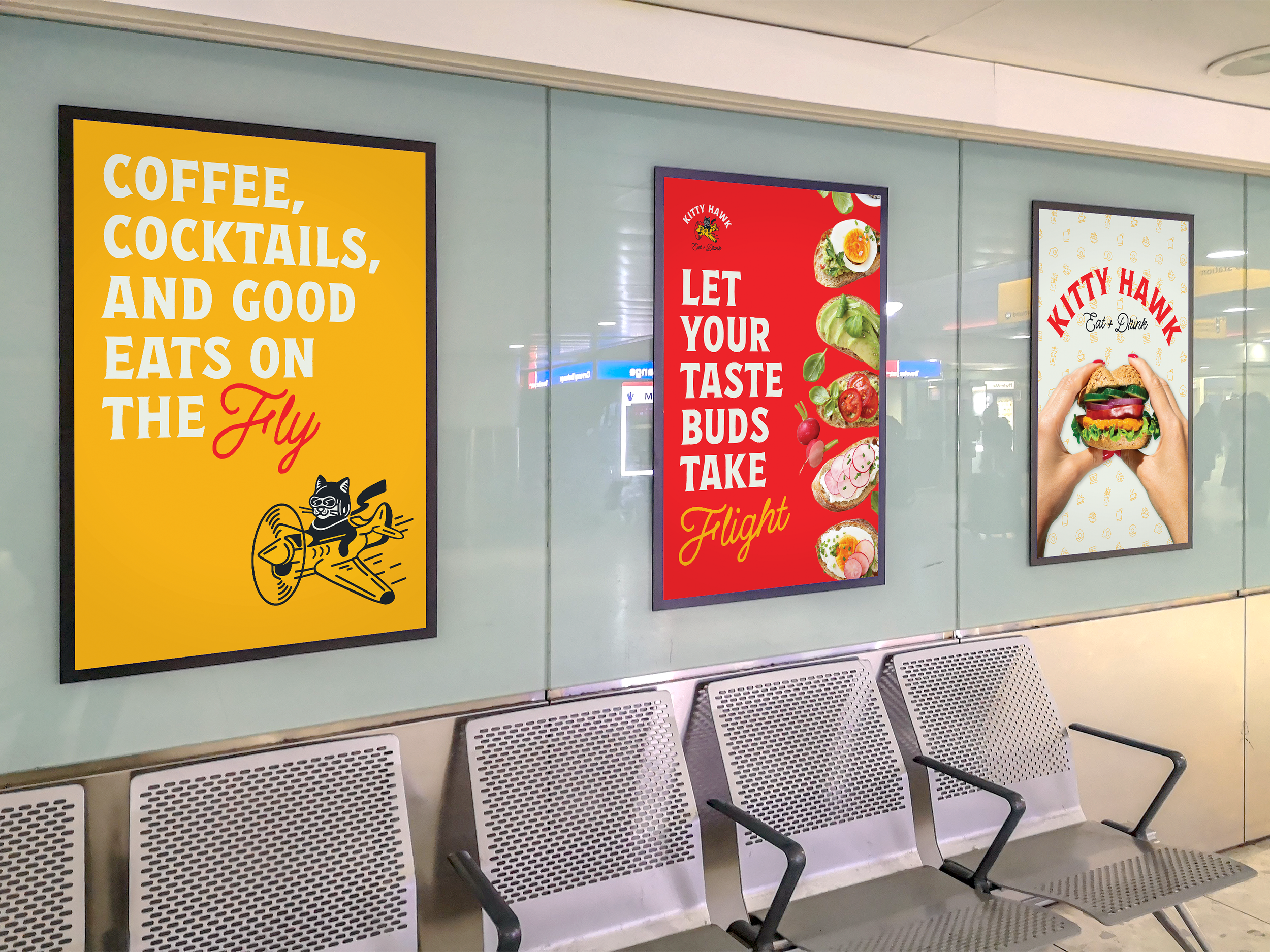
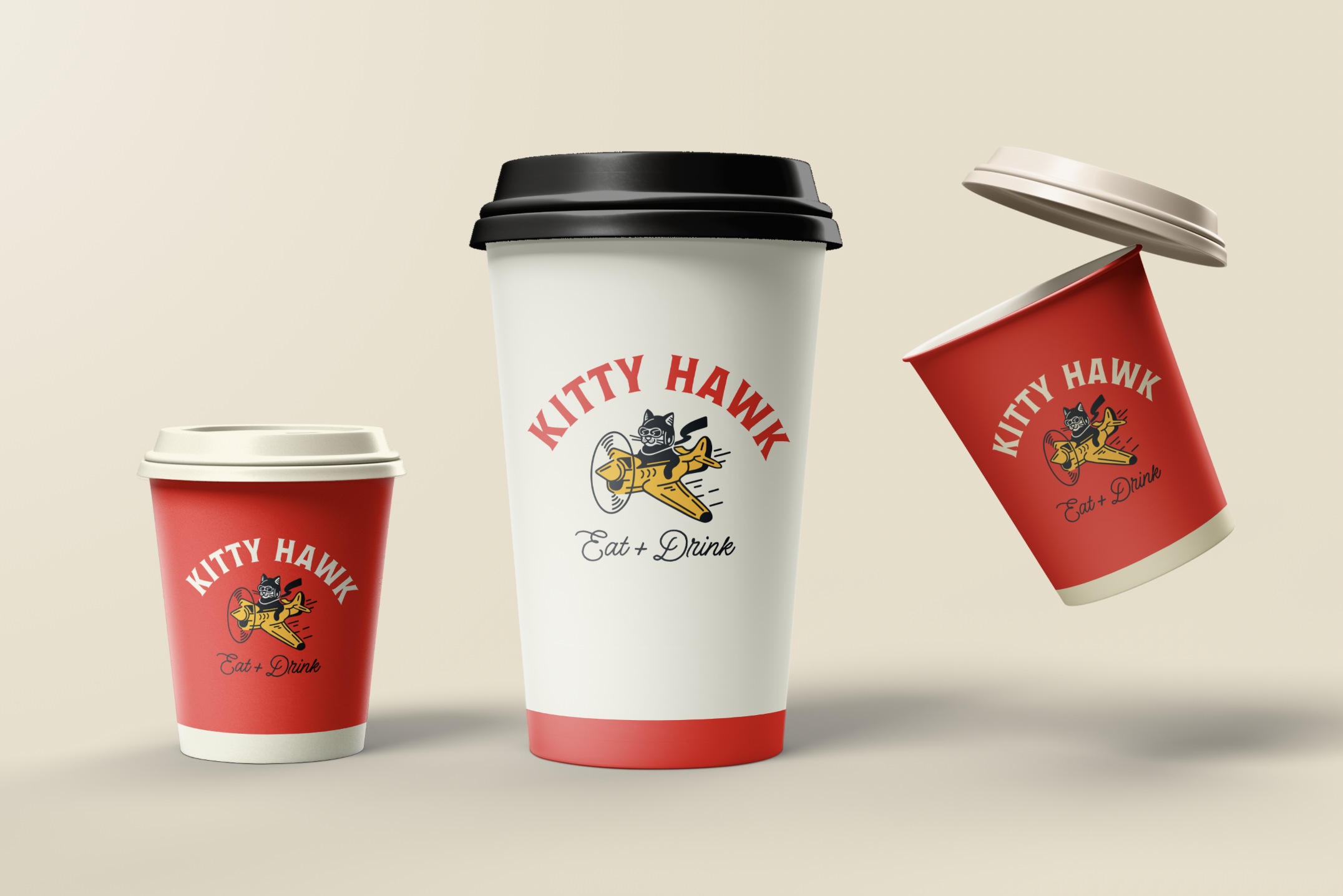
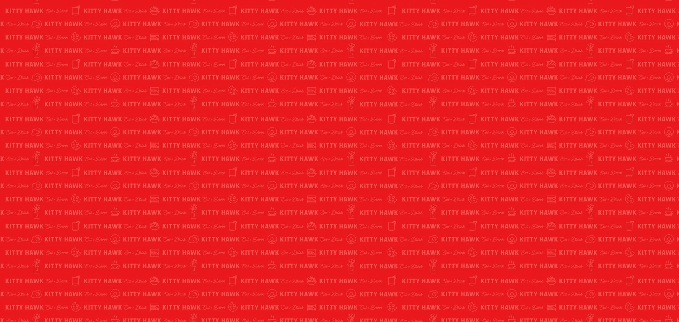
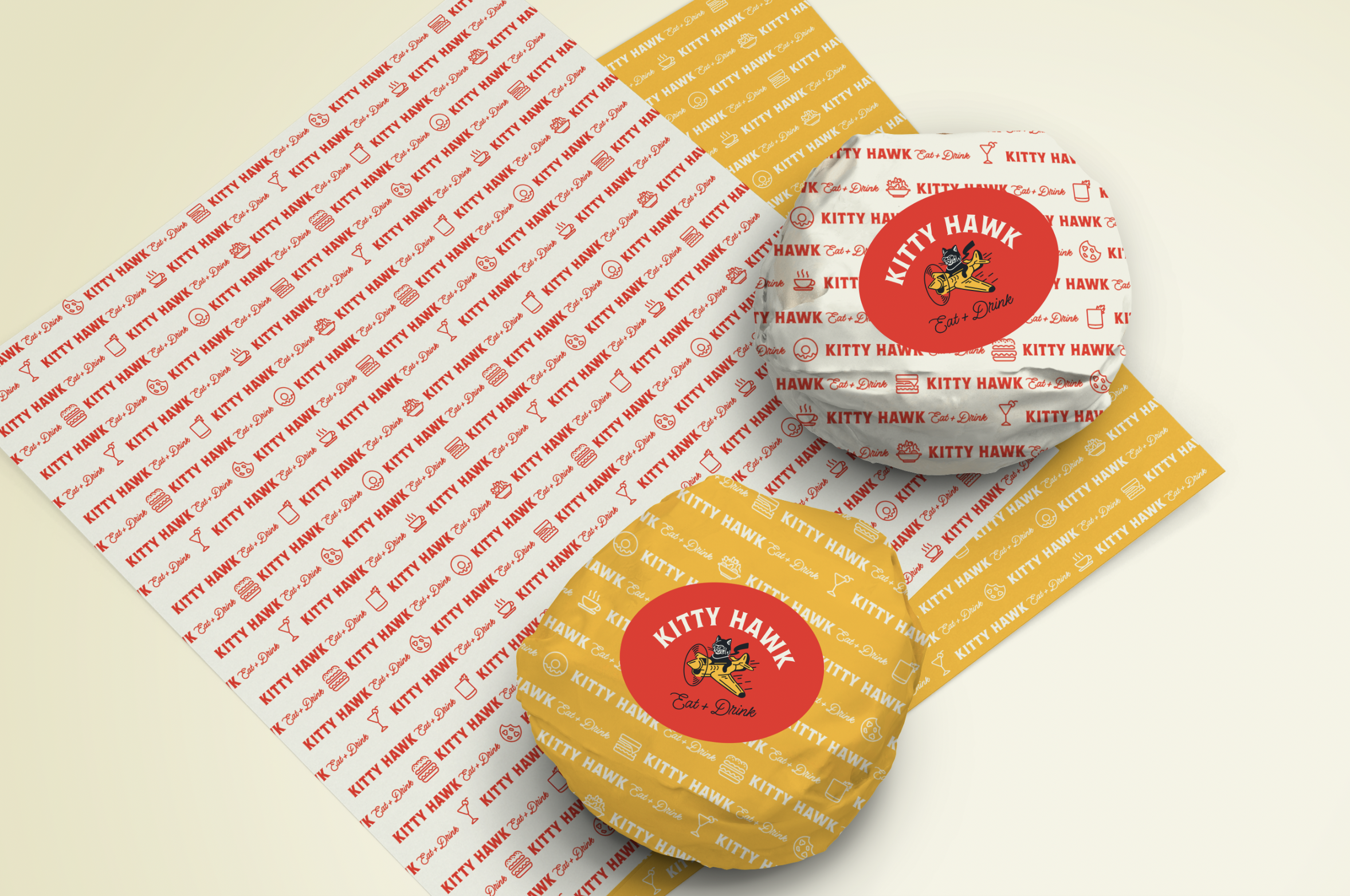
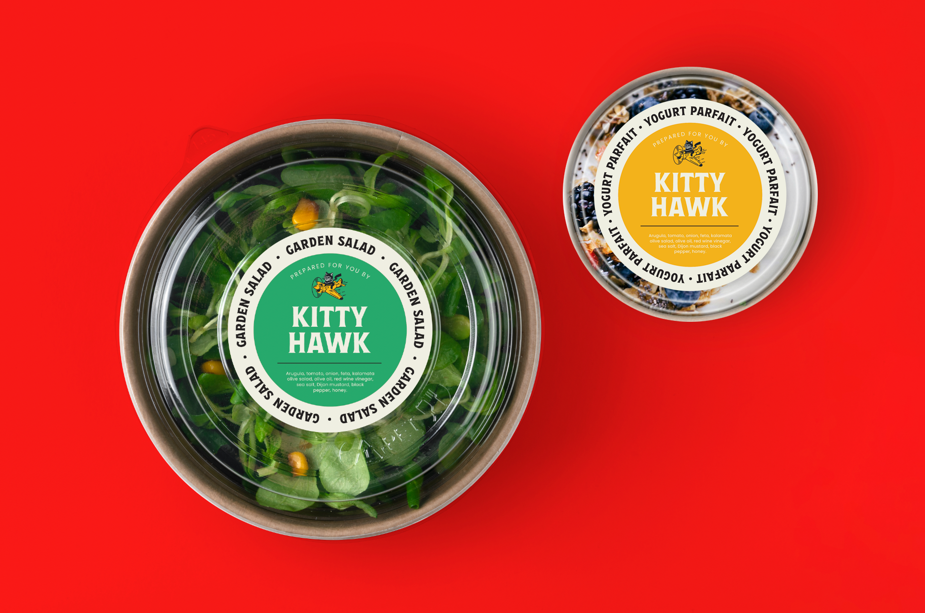
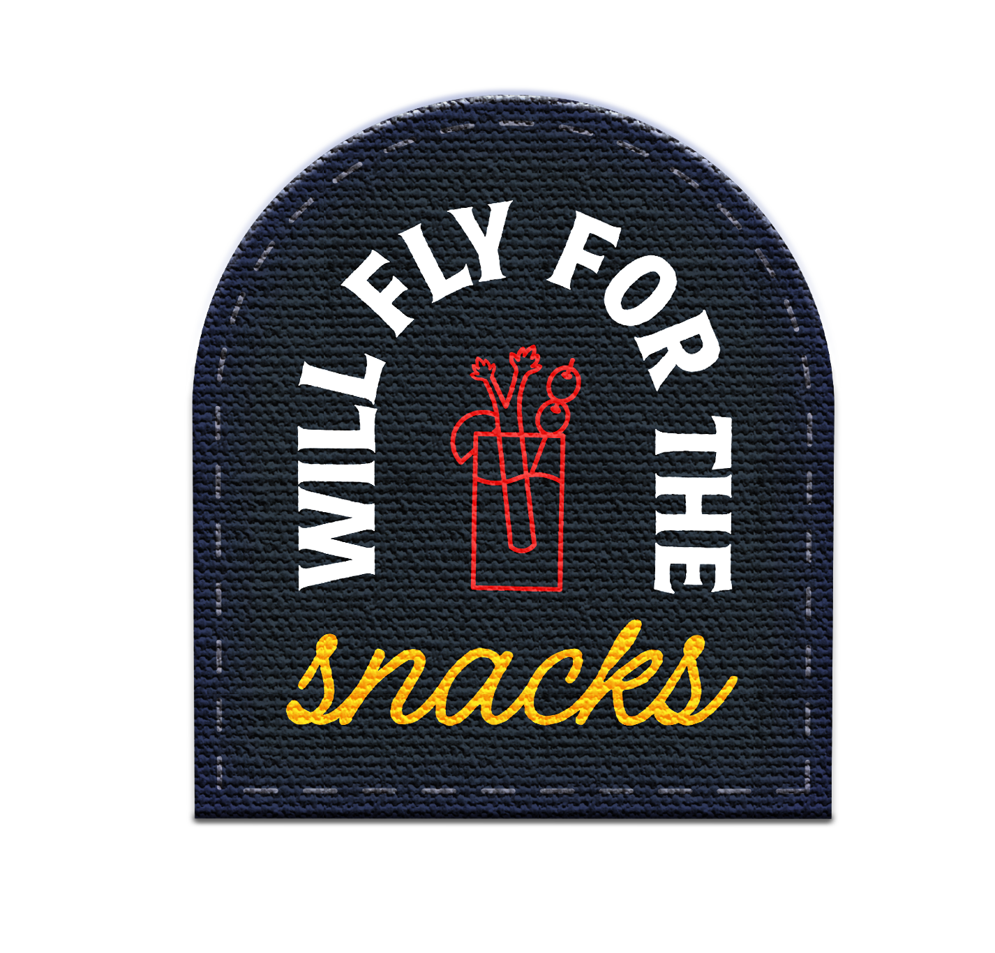
The creative journey spanned the entire spectrum of brand development. From the inception of the concept to the choice of the name, the creation of a captivating visual identity, and even the design of packaging, every aspect was meticulously curated to deliver a brand that embodies both playfulness and sophistication.
The branding endeavor didn't just end with the logo and colors; it extended into the physical space itself. “The identity we cultivated for Kitty Hawk played a pivotal role in influencing the interior design and overall ambiance of Nashville's newest favorite airport eatery.”
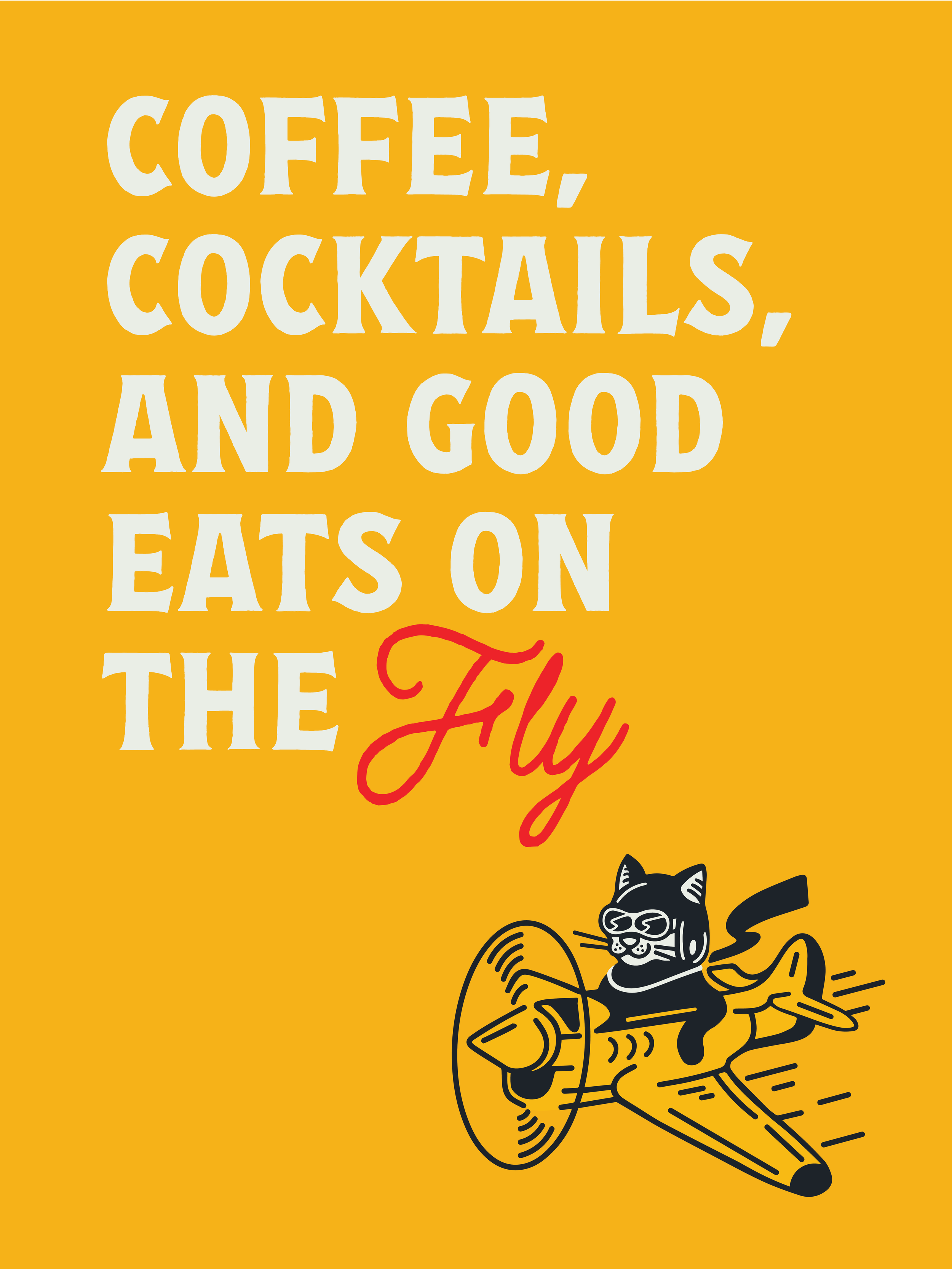
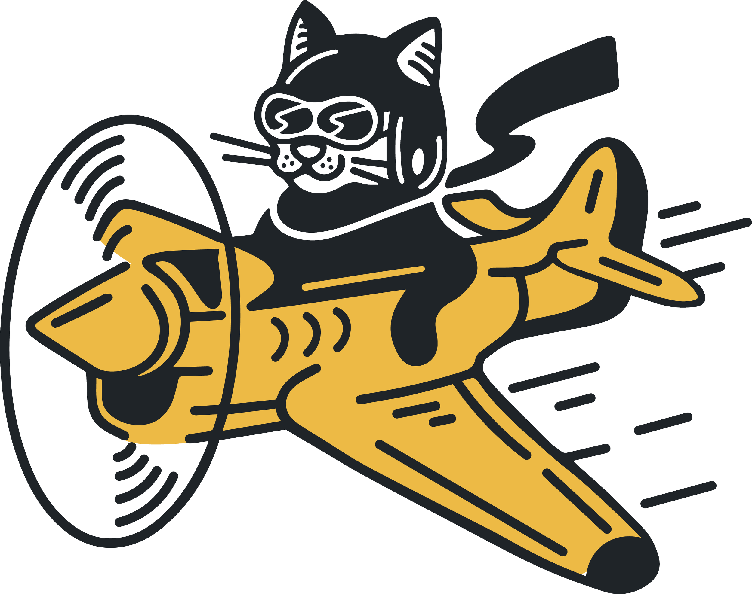
Kitty Hawk was conceived to offer customers not just delicious food, but also a joyful and nostalgic experience. With its iconic cat mascot, Hawk, at the heart of its logo, and vibrant colors, both online and in-store interactions aim to bring smiles to faces worldwide.
A brand built to delight travelers